
Garage Kombucha Rebrand
Garage Kombucha Rebrand

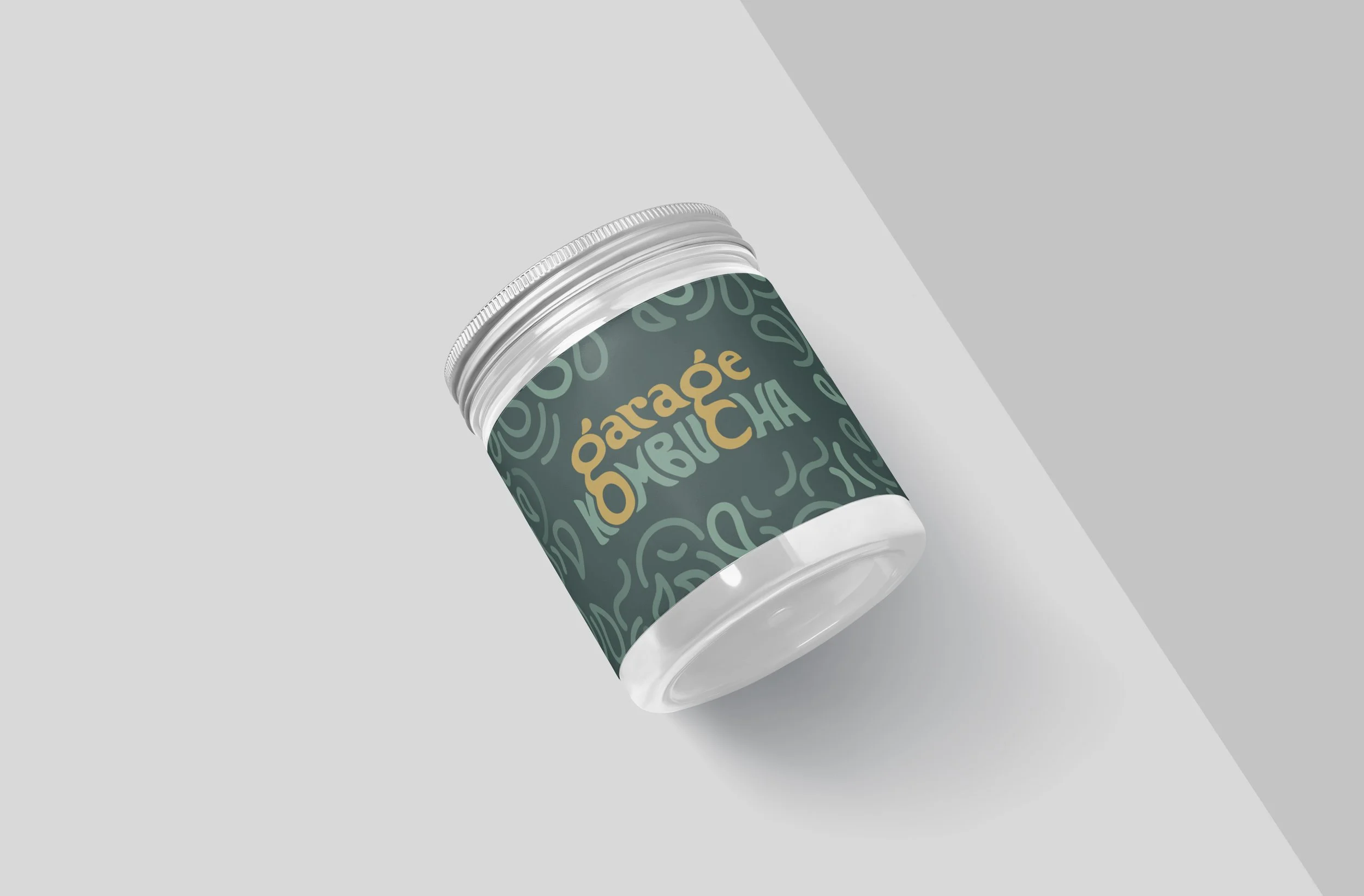
Garage Kombucha is a locally owned and operated kombucha company in Edmonton, AB. Their mission is to make the most delicious, highest quality, and most affordable kombucha available.
Their brand voice is welcoming, energetic and authentic. I wanted to create a brand identity that holistically represented that with a touch of modern fun.
Garage Kombucha Rebrand


BEHIND THE LOGO MARK:
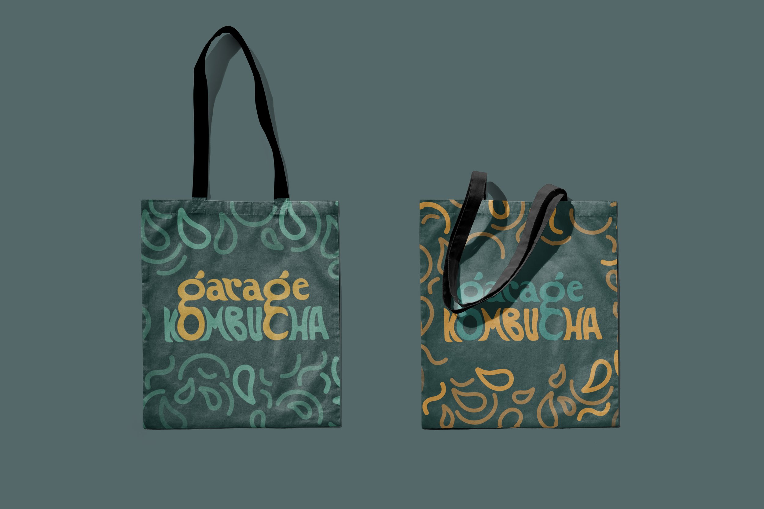
Garage Kombucha prides themselves on brewing a well-rounded and balanced kombucha.
I chose a serif typeface and refined the edges until it reflected this balance. I designed the top of the “g” to be subtly distorted vertically, and the bottom of the “g” distorted horizontally.
The ear of the “g” is designed to resemble a droplet, symbolizing the flow of a refreshing beverage, while it also references the fermentation process of kombucha, with its bacterial culture illustrated throughout the brand pattern.
All of these subtle design choices helped me create a logo mark and brand identity that holistically represents what Garage Kombucha’s mission is: to create a beautifully balanced, nutritious, and delicious kombucha.
this project was done as apart of my Corporate ID and Branding course in my final year of my Bachelor of Design studies.